Client: NoteMate
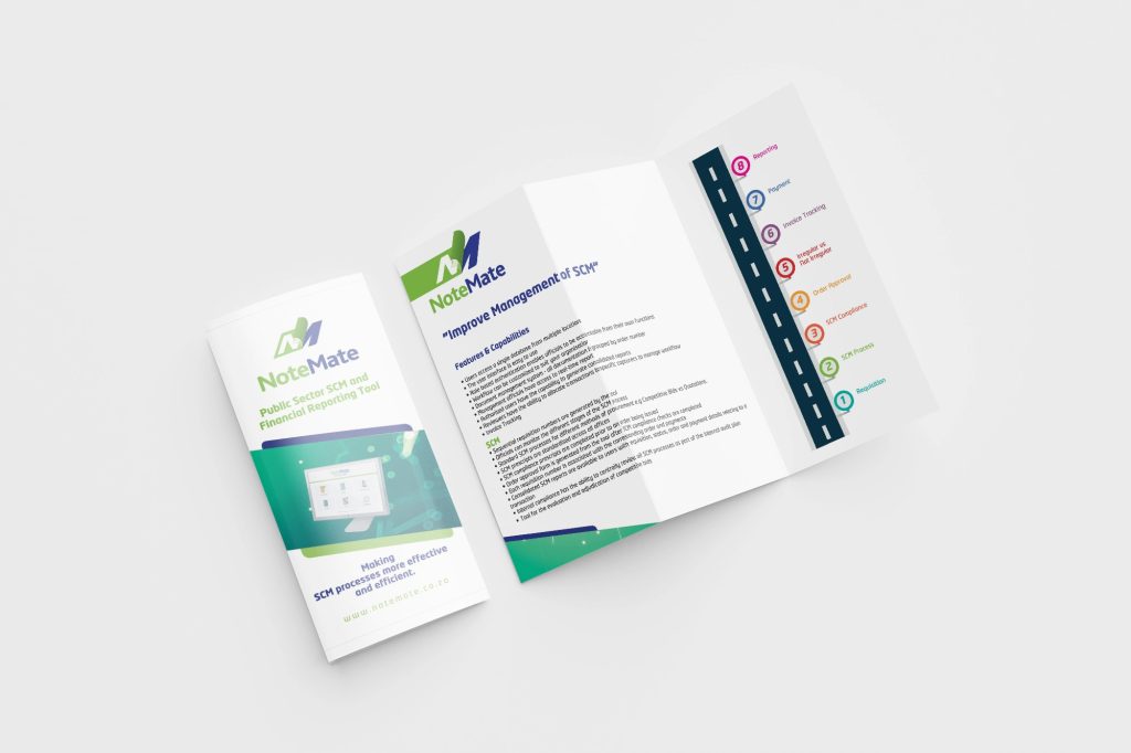
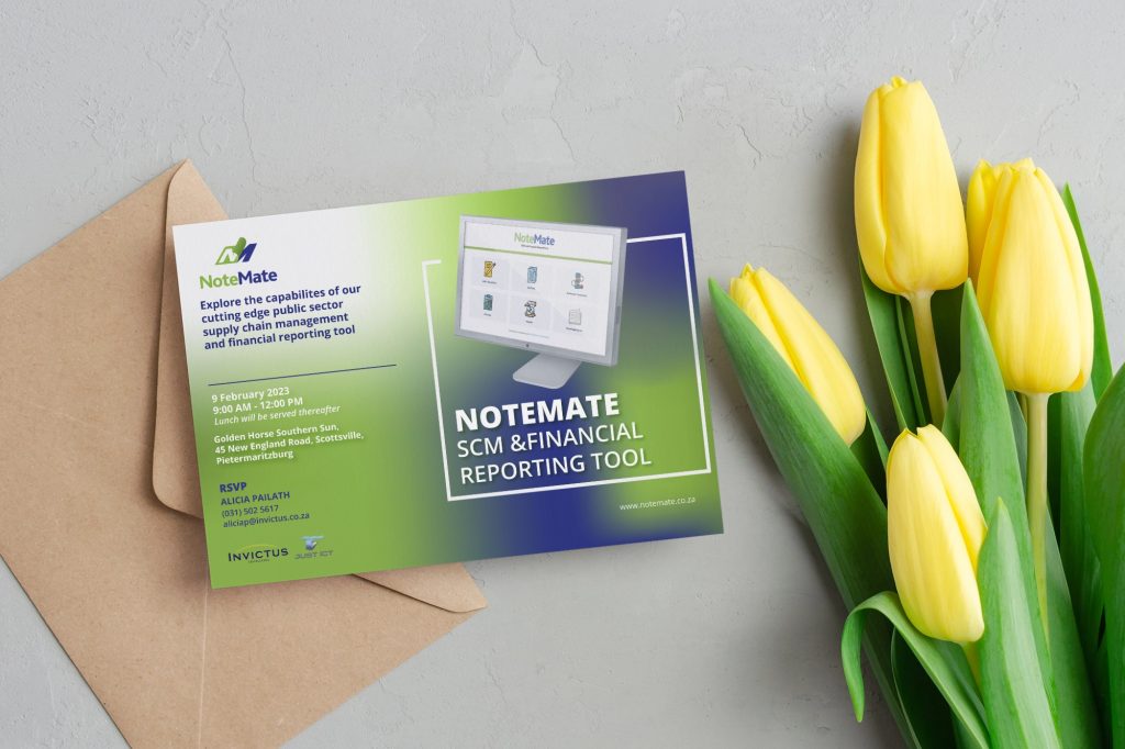
Project Overview: Our work with NoteMate focused on building a brand that embodies professionalism and innovation for the public sector. The logo uses a modern, clean typeface, with “Note” in vibrant green symbolizing growth and “Mate” in blue for reliability. A document-inspired icon represents the tool’s focus on streamlined financial reporting.
The website emphasizes usability and clarity, with an intuitive layout that makes complex information easy to digest. A cohesive color palette and accessible design ensure a seamless experience, helping users engage confidently with NoteMate’s solutions.
Outcome: Our thoughtful approach ensured NoteMate’s brand stands out in public sector tech, balancing trust with a fresh, modern feel.


